General Exploration and Popular Vote Over Time
This is my first blog post, for the week of September 2nd. The primary method of prediction for this week is a simple model based on the results of the past two presidential elections, 2016 and 2020.
In considering the data to begin with, it is interesting, though not particularly informative to take a look at how many elections each party has won in elections since the end of WWII.
Table: Table 1: Presidential races won by each party since 1948
| Party | Races Won |
|---|---|
| Democrat | 11 |
| Republican | 8 |
As shown in the table, Democratic presidential candidates have won the popular vote in 11 of the past 19 elections, and Republican candidates 8. Though not a fifty-fifty split, no one party is winning every election. One takeaway to highlight from this table is that there truly are not many elections we can use to train predictive models. There have only been 19 presidential elections since 1948, which means that the impact of outliers in the data may be extra large.
The graph below maps the two-party vote share for the Democratic and Republican parties since 1948.
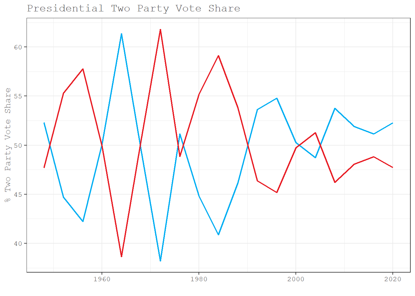
Two-party vote share as a statistic measures the percentage of the vote that either party gets among only voters who voted for the Democratic or Republican candidate (and as such does not include third party votes). Looking at the graph we see that win margins have decreased over time, marking an increase in election competitiveness since the 1990s.
Taking a look at each state over time, there really is a lot of consistency.
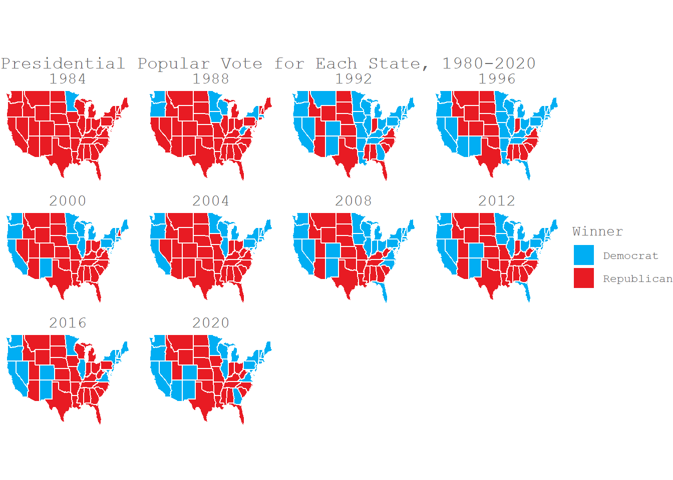
The West Coast (OR, WA, CA) is pretty steadily blue, along with the Northeast. Minnesota is pretty much always blue, even back when Reagan was running, which is really interesting to me (as a person from Minnesota). The states down the middle of the country and the south in general are red most or all of the time. States that are typically considered swing show a bit more variation. That being said, even those states usually fall one way. MI, WI, NV and PA almost always go blue, while GA, NC and AZ almost always go red.
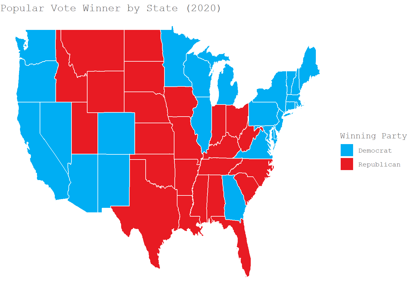
2020 Electoral Maps
The map below shows the winner of the popular vote for each state in the 2020 election.
 And this one the vote margin in those states.
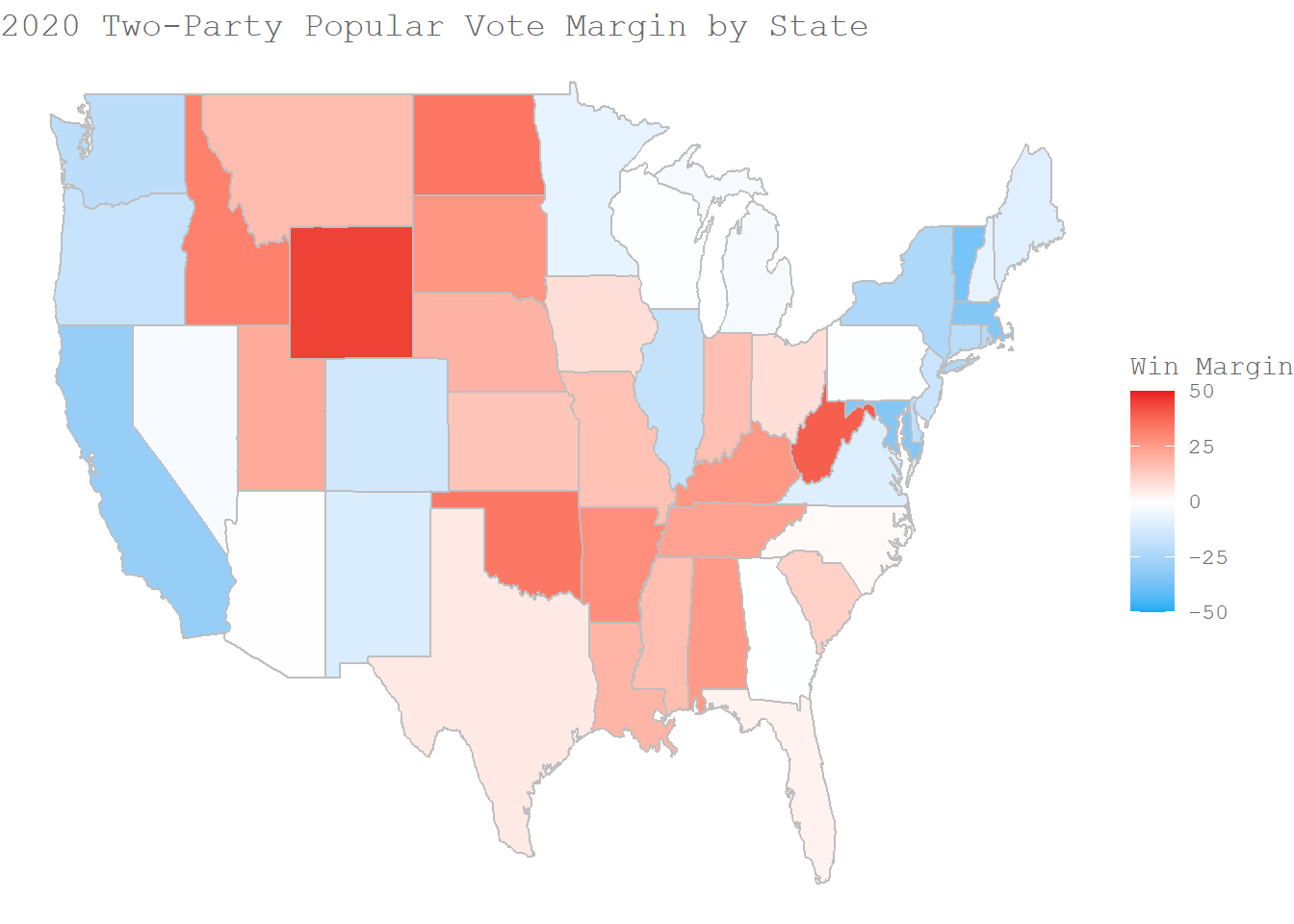 As we can see in this map, the winning margin in swing states is very close to zero, and those states have very tight and competitive presidential races. Further, very few states are solid red or blue, which is something that isn't always clear in a simple non-gradient map like the first. 2020 was a particularly contentious election, with recounts requested in several swing states, several of which also heard cases in court about the election
A Simple Prediction of 2024
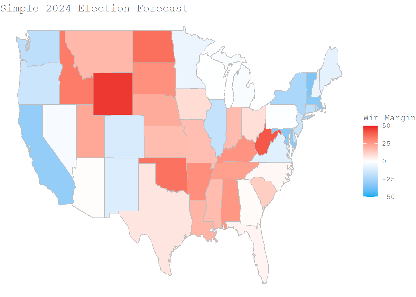
The graph above shows the predicted vote share for each party based on the a simple model: vote share 2024 = 0.75 * vote share 2020 + 0.2 * vote share 2016.
The model, which is based only on the 2016 and 2020 elections, predicts that most states will lean slightly more Republican than in 2020.
I look forward to making more sophisticated models as the semester continues on, incorporating both a finer-grain analysis and other variables that factor into presidential election outcomes like incumbency, economic conditions, the campaign, and so on.